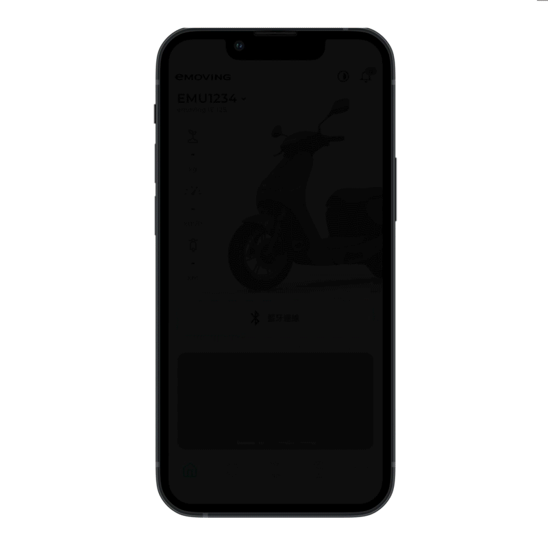
The most powerful APP for eMoving e-scooter riders, integrating IoV technology.
This is a mobile app redesign project of eMoving Fun Riding. With the app, it helps to keep CMC’s e-scooter owners to pair their electric motor scooter and sync with the app to monitor battery levels, unlock and start the scooter securely, and tailor their mobility in a personalised way.
With CMC’s new e-scooter (EZ1) launch, the main objective is to integrate the new generation product’s features to the existing mobile app. More importantly, redesigning the app with a refreshing look and feel, as well as easier-to-use and streamlined experiences for better customer satisfaction and offering more value to users.
We launched the redesign of the eMoving Fun Riding app on iOS and Android in 10 months, and users have positive feedback on the app's features and the simplistic redesign. Also, we improved on key acquisition and adoption metrics, especially it expands the customer base by 41.5%.

CMC (China Motor Co.) is one of the most experienced e-scooter company. Seeing an opportunity to accelerate the shift to sustainable urban mobility, their scooter brand eMoving partnered up with the global e-scooter pioneer Gogoro in the fourth quarter of 2020 and joined the Powered by Gogoro Network (PBGN) program to develop unique eMoving scooters that use Gogoro’s battery swapping service. That is to say, their products would divide into two categories – fast-charging and battery-swapping scooters. Therefore, CMC wanted to embed new product’s feature with their current Fun Riding APP, and simultaneously refresh the mobile app and optimise the user experience.
The biggest challenge was how to keep the information architecture (IA) lean and simple while scaling the current application? With an app redesign, it is critical to consider the combination of these components: design, engineering and users’ mental models. How to integrate the upcoming set of new features and at the same time maintaining a certain level of predictability to make sense still for current users? Reassessing the overall structure will save the effort of design and development team, and even current users. In addition, the other task at hand was to align on the specific user problems, find optimal solutions and improve the overall user experience.

As it is a mobile app redesign, it’s a good opportunity to look into who the users are and conduct research backed with authentic feedback. With these valuable feedback, it helps us to build a holistic understanding of how customers use the product, learn more about the needs of different users, as well as figuring out their frustrations. The insights will enable us deeply empathise with the end–users, and then determine the direction of our product development on how we can continue to improve the experiences we deliver.
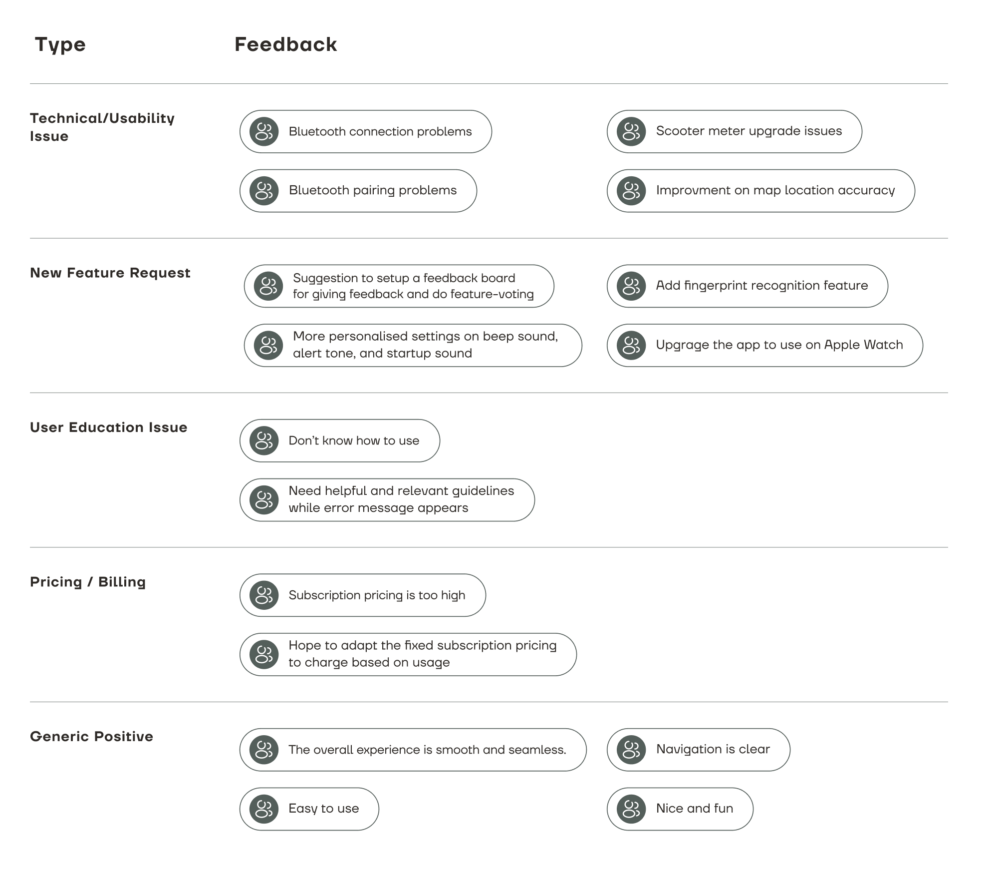
In most situations, people feel motivated to provide feedback if they have extreme experience. That is to say, customers are more motivated to give feedback when they have a very positive or unhappy experience about the product. Accordingly, customer feedback deserves special attention, which serves as a guiding resource for the growth of the application. We collected reviews and feedback from App Store, Google Play, as well as customer service centre and salespeople. Next, we categorised the feedback into different types to help us making sense of user issues.
To gather more qualitative data about customer's motivation and the root cause of the issues, we proceeded to the in-depth interview stage. We carried out interviews with 5 users who actively used the app, in order to gain a better insight into:
Subsequently, we synthesised the findings in the following affinity map:

Using insights from the gathered information, I created two user personas to represent key audience segments. User personals help to create understanding and empathy with the end-users from a user-centred point of view, and also allow us to better position the product and prioritise feature requests.

In this phase, we discussed with CMC team and listed the goals for the project, looking for the delicate balance between delivering business goals, user needs and technical constraints. Aiming to find the intersection of desirability, feasibility, and viability.

Based on the research findings, we scoped the redesign into 3 main areas: onboarding guide, guidance for Bluetooth connection and flexible battery subscription plan, each of which sit at the intersection of customer pain points and high business impact.

After the strategic focus areas were identified, we sketched out ideas quickly and discussed with the team. Once having a clear direction, I digitised the sketches into mid-fidelity wireframes and interactive prototypes to explore and spark discussions, to validate ideas, and to discover problems.
For user onboarding, we found out non-tech savvy users or first-time users didn't know where to start after logged in. Hence, we created onboarding screens to help users get familiar with the interface, and also to help users understand and experience how the app is going to help them achieve their goal. In doing so, it supports users to learn and find value from the app, and eventually increase user retention. We developed two guide formats, including A) carousels and B) tooltips, to find out which one performs better.
With bluetooth connection, two main issues were discovered: (1) users find Bluetooth's connectivity to be unreliable; and (2) some users need further guidance if a connection error occurred. Accordingly, we focused on making Bluetooth's connectivity to be more reliable and effective in terms of technical aspects, as well as improving general usability by offering more guidance.

As we learned that a large proportion of the users are short-range commuters and charging their scooters at home, the marketing team of CMC would like to leverage tailored subscription plans for customers' needs. Therefore, we planned to launch a new subscription offering of a lower-cost plan to charge based on usage for those who want to pay only for what they use.
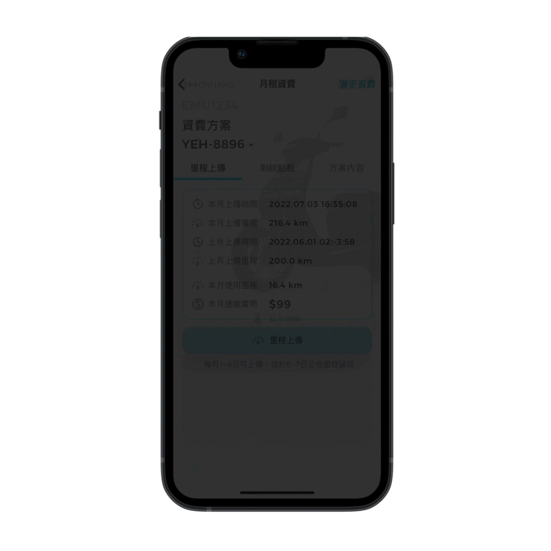
After discussing with clients and developers and referring to other pricing models in the SaaS industries, we decided to adopt a hybrid pricing strategy that combines fixed pricing and usage-based models to help better serve customers and also diversify company’s revenue streams. To be more specific, customers would be charged a flat-rate of NT$399 each month with unlimited mileage. If their travel distance is less than 399 km per month, they will only pay by their usage, which is $1 per kilometre with a minimum charge of $99.
Next, here comes the challenge. How to calculate and validate their monthly usage? Is it possible for users to upload their ODO (total distance travelled) by taking a photo of their meter through the APP? How to effectively recognise the numbers from the image uploaded by customers? Subsequently, after evaluating technical feasibility and accessibility, we intended to do the text recognition on server-side to reduce processing time and to ensure data accuracy.

Furthermore, another main goal of the project is to redesign the app with a refreshing look that suits their new product series. With its sleek design, the new smart scooter is connected to the Internet of Things and the customisable features can also be accessed via mobile phone. In the beginning, we discussed about creating both light and dark mode interface styles. However, developing both colour mode would take much more time and effort, and some studies showed that light letters on dark backgrounds would alter the visual focus, causing reading comprehension to be lower. On top of that, dark theme is more difficult to read outdoors in bright conditions. For the app design, considering the time constraints and visibility, we chose a light colour scheme to create a sleek, futuristic and smart-home look.


As growing the app, we firstly took a step back and reassess the the overall structure and dissected each new feature to find ways to integrate into the existing system. It is significant to keep the information architecture simple and maintain a certain level of consistency that still makes sense for current users. Most importantly, a well-designed and scaleable information architecture enables design and development more efficient, saving a lot of efforts.

In the iterative model, it allowed us to revise and refine the product more rapidly and involve stakeholders and clients more effectively.

We prototyped two guide formats, including carousels and tooltips. It turned out that onboarding tooltips worked better, which enabled users to understand the features in a more contextual and interactive way. The buttons and icons are at the exact position on the screen, so it is easier for users get the sense of it directly.
Users don't read word by word, most of the times they scan through screens. Therefore, we tweaked the copy as concise as possible, and also made it consistent in different product lines.
Friendly onboarding messages during a user journey can be comforting and helpful to users. It is an effective way for guiding users through the app’s features, making them more satisfied and engaged.
We offered a step-by-step guidance before users make bluetooth connection, making it easier to follow.
Using exact product images with simple text as a visual aid also help assist users with the operation of the connection, which is more immediately recognised and recalled than with only written words.
To create a well-tailored strategy, we adopted a hybrid pricing model to balance business’s profitability and customer needs. It helps alleviate the cons of a traditional flat-rate model, that users would only be charged based on their actual usage. On the other hand, it also provides a stable monthly revenue stream for business, allowing them to focus on improving customer retention through better products/services, which is more aligned with user needs.
We explored multiple ways to calculate user’s monthly usage, such as using odometer systems on the scooter and operating on software libraries like Google's ML kit for text recognition. Either of them was lack of stability. Due to constraints of hardware, software, time and budget, a feasible solution was to offer a feature that enables users to upload their meter photo monthly and the mileage to be calculated by text recognition in backend. In usability testing, it is also usable by customers.


The redesign of the eMoving Fun Riding app on iOS and Android has had a positive impact in many aspects, especially it expanded customer base by 41.5% compared to the previous year. In addition, we also received positive feedback from user on App Store / Google Play.
Launching is only the beginning. The team continues to polish and evolve the app, constantly fixing reported bugs and updating new features in the product team’s backlog. According the product roadmap, the next steps would be:
Throughout the process, we are constantly deciding on tradeoffs. Which research method should be adopted given our time and resources? What features should prioritise more? If it cannot technically be built, what’s the second-best solution? Should we extend the deadline? I found myself truly enjoying the process of strategising and designing. Some key takeaways are: